
I made a magazine out of my X bookmarks. It's called The Plenitude of Arboreal Beauty, and I read it on a Kindle Scribe Colorsoft.
I found the name in Santayana, and it was the name of my blog for years. It describes the experience of seeing the ideal form of a Tree in Plato's heaven.
The idea was to take five or ten things I'd bookmarked and turn them into my own version of Works in Progress, the printed magazine. Each issue pulls my bookmarks, edits the long pieces, generates paintings, and lays it all out in Paper. The PDF goes to the Scribe, and I read it there and write on it with the stylus. No. 1 came out at 32 pages. The first draft of No. 2 is 50.
Here's No. 1. Turn the pages, or see them all at once.
Designing for e-ink
I specifically designed the layout and type for the Scribe's display. Pages are 3:4, its shape, and exported at its native resolution. It's a PDF and not an EPUB, because Send to Kindle turns an EPUB into a reflowing book, and on a Scribe you can't write on a book, only add sticky notes.
The first version I read on the device had type that was too thin, and one page I couldn't read at all. Part of the problem was Paper's PDF export, which embedded every font at its Light weight. Now every page is exported as an image, darkened a little, and assembled into the PDF. The dark contents page was hard to read too, so it's light now.
How an issue gets made
A headless browser with a copy of my profile fetches the bookmarks, read-only, and a ledger keeps anything from showing up twice. Video bookmarks become "Watched for You" articles, with quotes, redrawn slides, and a QR code to the original. Each piece is cut to a word budget, but the author's words stay the author's, and anything the editor adds is set apart.
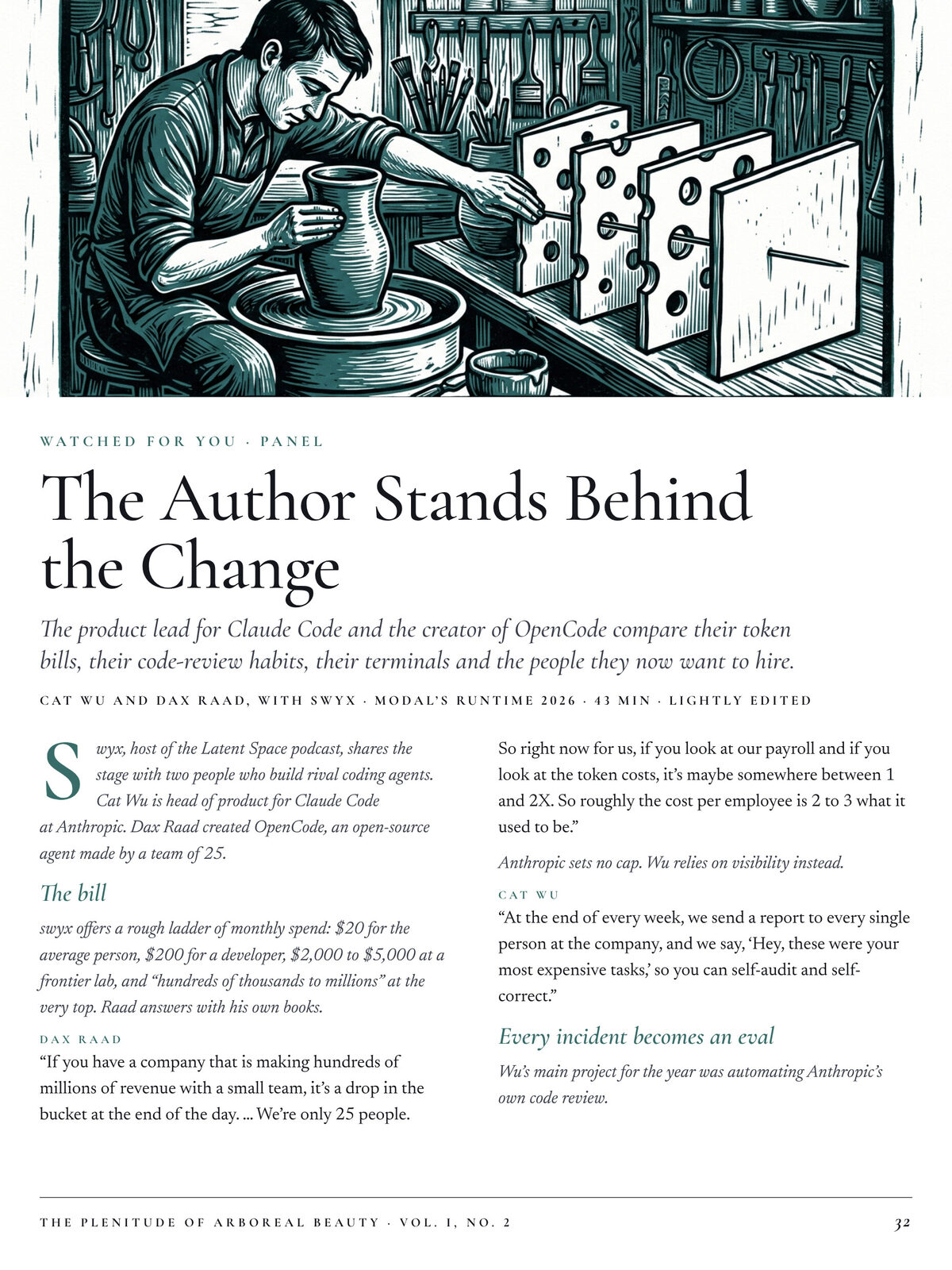
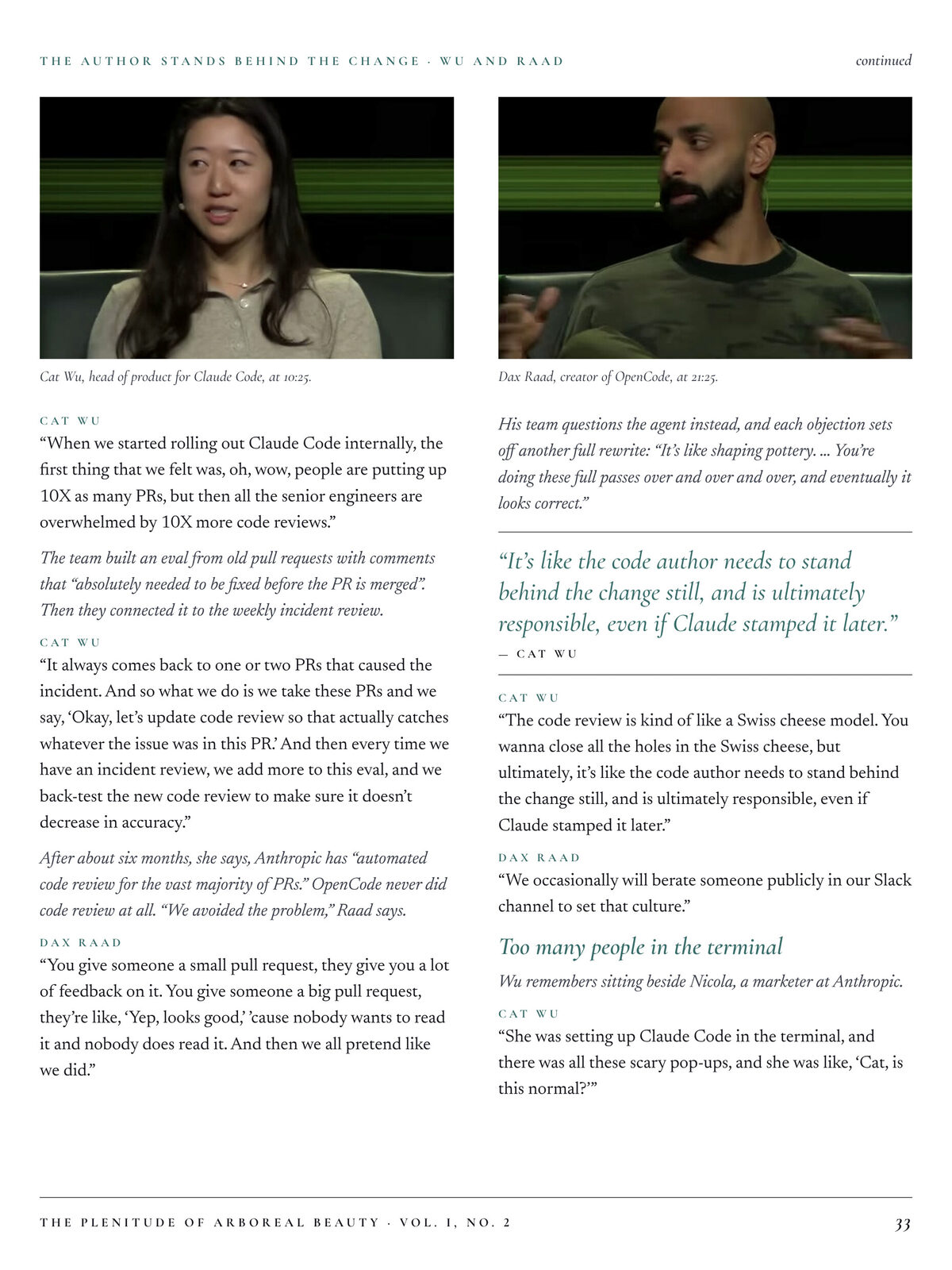
A look for every piece
In the first draft, all the illustration styles were basically the same. Now the house style stays fixed (masthead, type, grid, captions) and every piece gets its own color, paper, and illustration style to match its attitude. No. 2 doesn't reuse any of No. 1's styles.
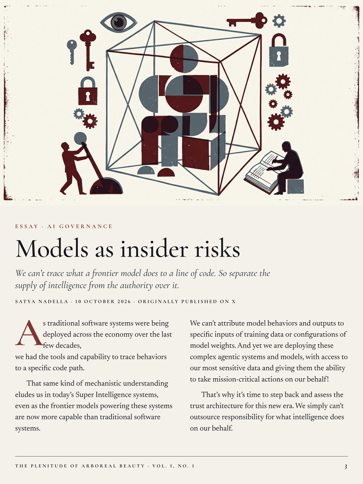
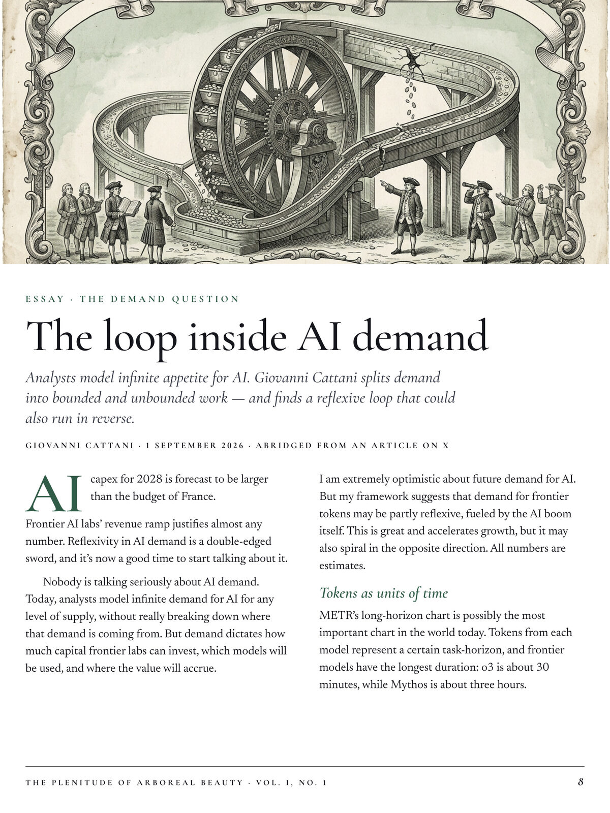
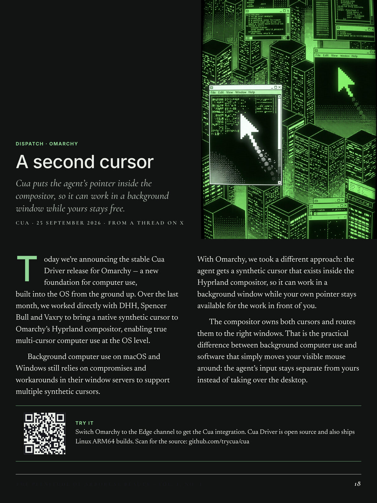
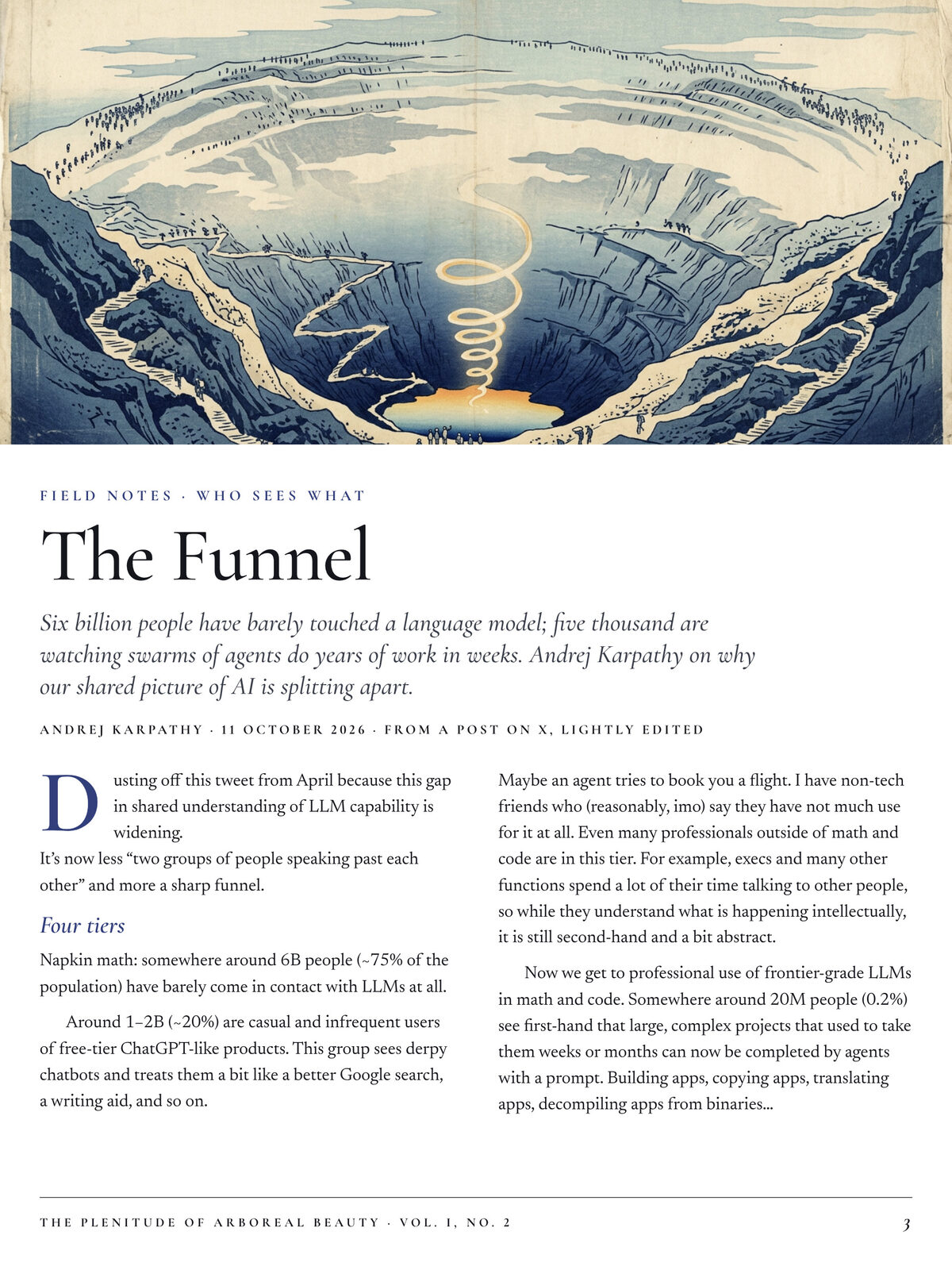
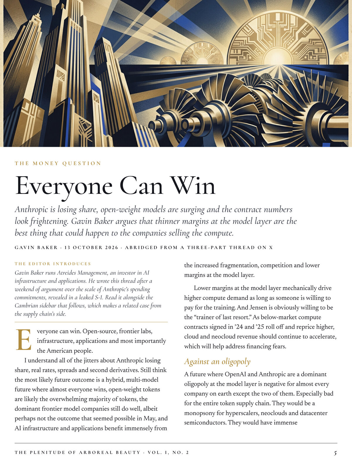
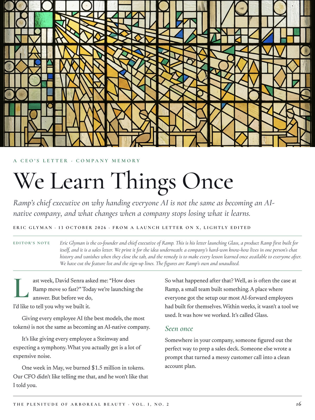
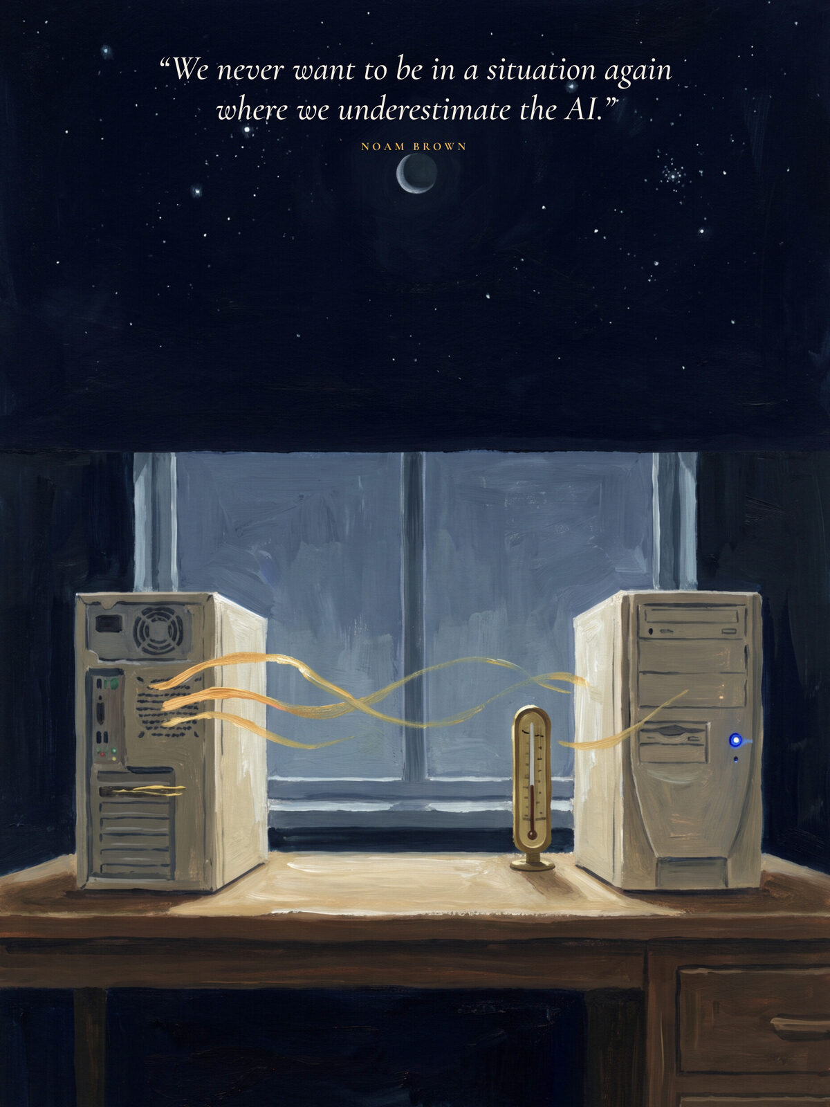
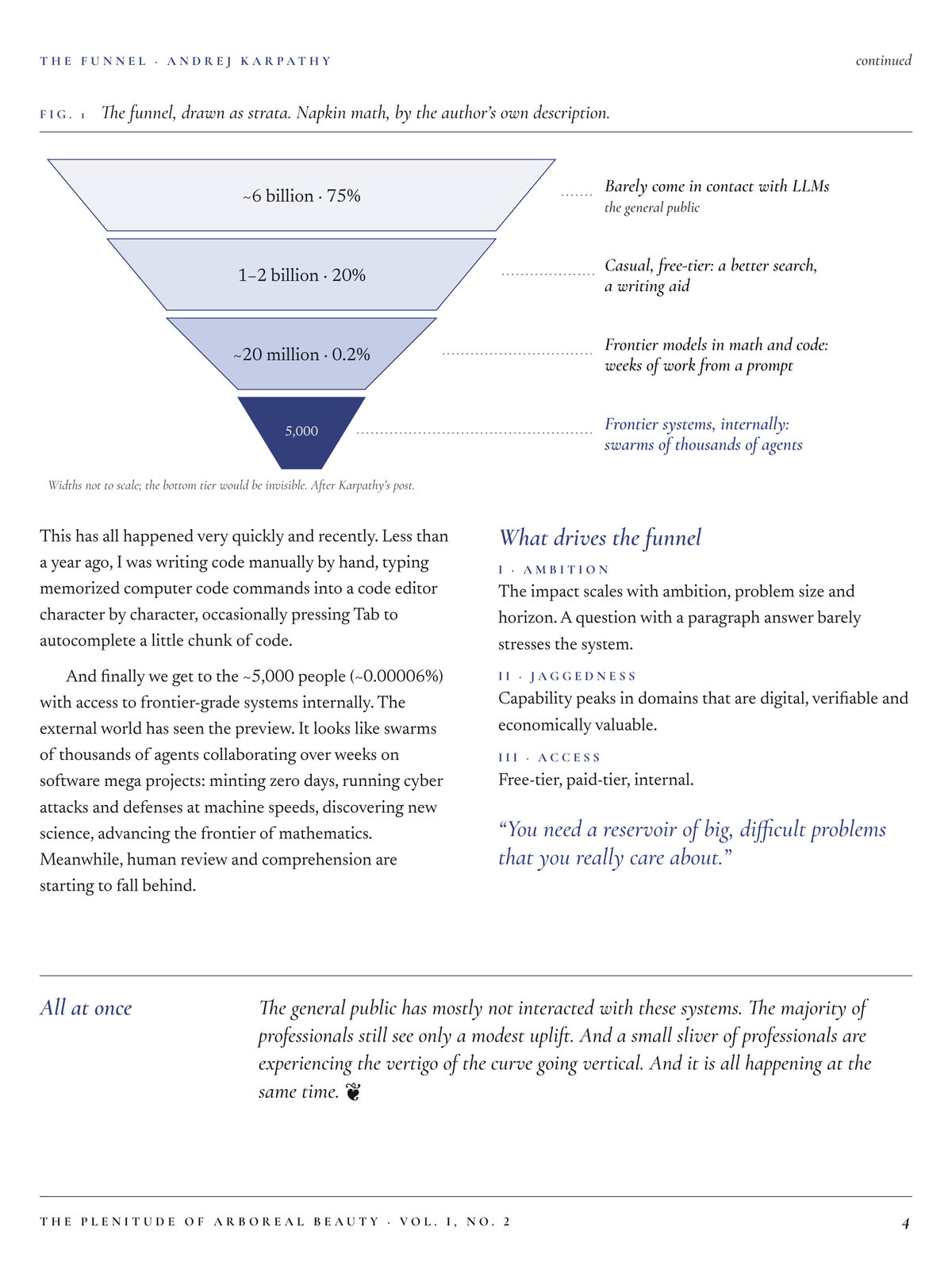
All the pages were light at first, too. Magazines I like alternate, so now covers, section openers, and breathing pages (a full illustration and one quote) go dark or saturated, and pages you read or write on stay light. Diagrams have their own rules: hairline strokes, one accent color, no gray boxes.
Pages you write on
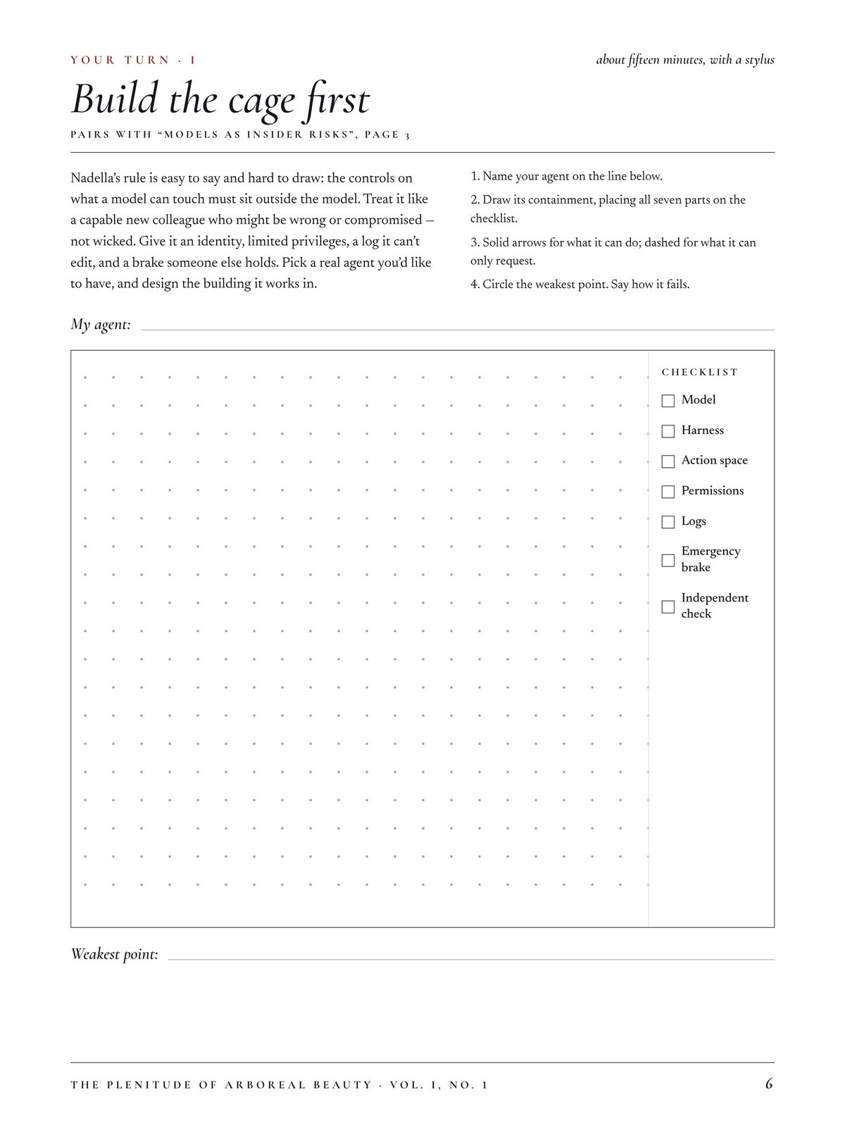
Some pages are exercises paired with an article, on dot grids or ruled lines: draw something, predict something, do some math. No. 2 has a sealed envelope of predictions to open in November 2027. The last page is Letters to the Editor, where I write feedback for the next issue.
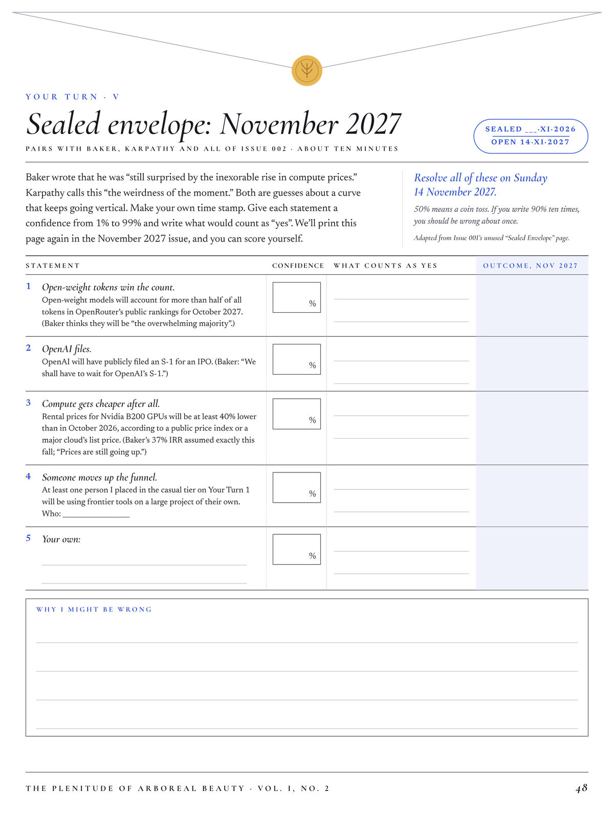
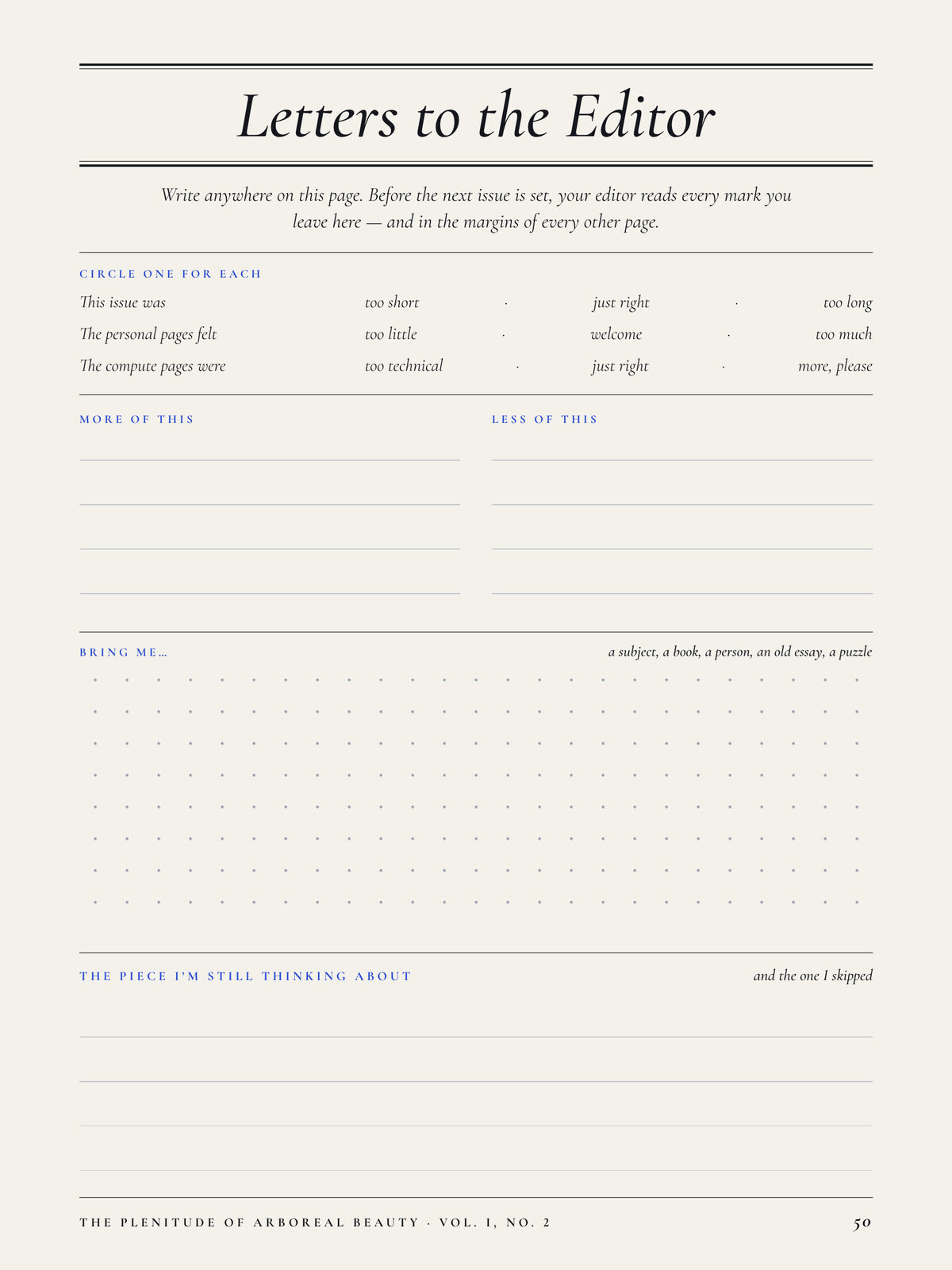
A few pages are personal, based on a private brief from my pendant recordings and meeting notes.
The loop isn't closed yet. Amazon doesn't offer any way to read the ink on a PDF, so the next step is pulling my notes off the Scribe over USB and folding them into the next issue.
Now all I have to do is actually read it.